
 admin
admin
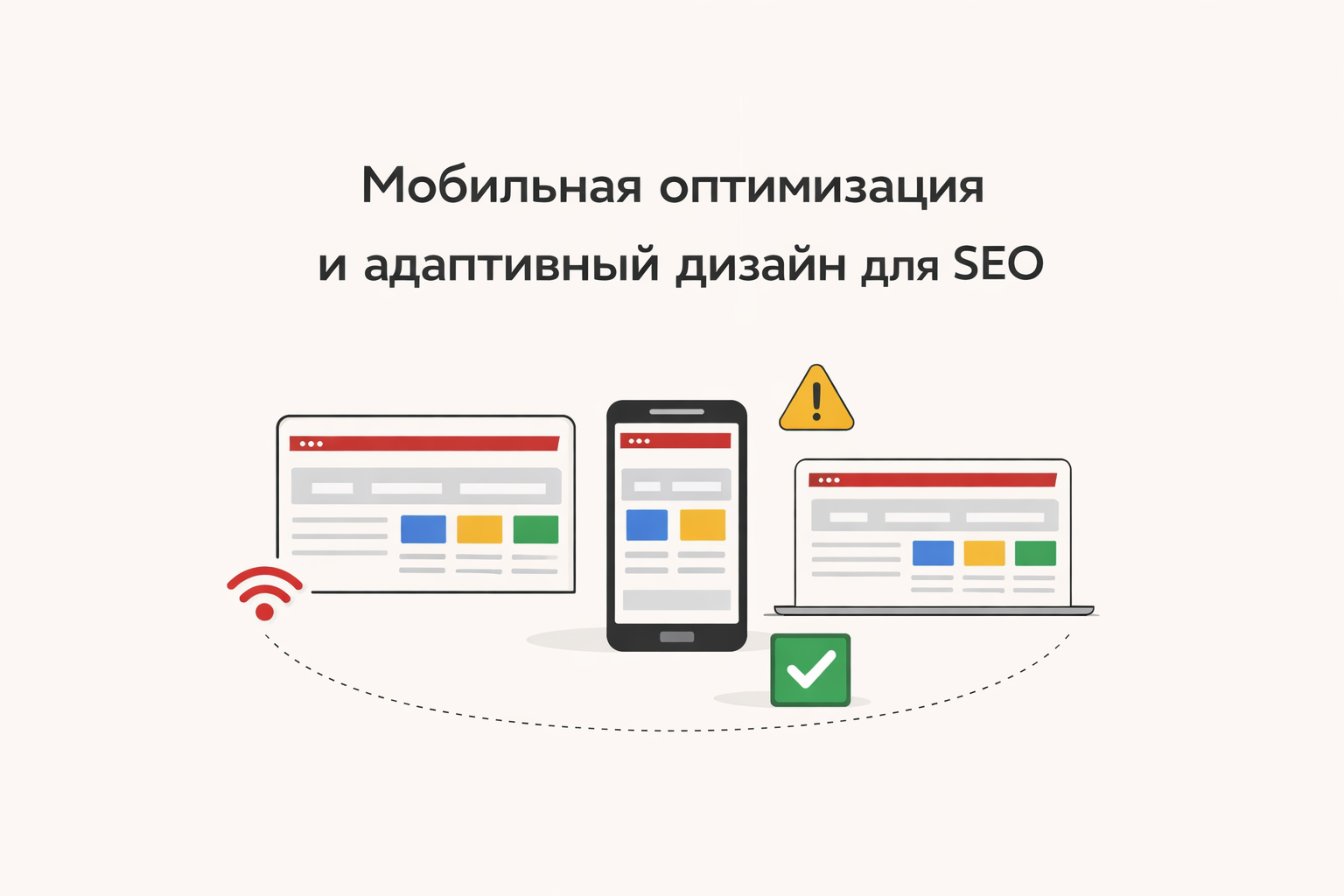
Mobile Optimization and Responsive Design for SEO
Today, over 70% of users access websites from smartphones. That's why Google has adopted the Mobile-First Indexing principle — meaning the mobile version of a website is primarily evaluated.
If a site performs poorly on phones, it loses search rankings and customers.
What is Mobile Optimization
Mobile optimization is the process of configuring a website for correct display and fast performance on smartphones and tablets.
Responsive design is an approach where a website automatically adjusts to screen size.
Why is it Important for SEO
Google considers:
-
mobile usability
-
loading speed
-
text readability
-
correct display of elements
If a site is not optimized, it receives a lower ranking.
Common Mobile Version Mistakes
1. Site not adapted to the screen
Users have to zoom in on the page.
📌 Solution: use responsive layout (responsive design)
2. Text too small
Text is difficult to read without zooming.
📌 Solution:
-
font size from 16px
-
sufficient spacing
3. Buttons too small
Users cannot tap on elements.
📌 Solution:
-
increase button size
-
add spacing between elements
4. Slow loading
Mobile internet is often slower.
📌 Solution:
-
image optimization
-
lazy loading
-
code minimization
5. Using Flash and outdated technologies
Modern browsers do not support them.
📌 Solution: use HTML5 and modern standards
How to Check Mobile Optimization
-
Google Mobile-Friendly Test — responsiveness check
-
Google Search Console — mobile error report
-
Google PageSpeed Insights — speed analysis
Principles of Responsive Design
1. Flexible Grid
Content scales to fit the screen.
2. Media Queries (CSS)
Allow changing styles for different devices:
body {
font-size: 16px;
}
}
3. Flexible Images
max-width: 100%;
height: auto;
}
4. Mobile-First Approach
Design for mobile devices is created first, then for desktops.
How to Improve Mobile SEO
-
Use responsive design
-
Speed up site loading
-
Simplify navigation
-
Make buttons large
-
Remove unnecessary elements
-
Test the site on different devices
-
Optimize Core Web Vitals
Additional Tips
-
Avoid pop-ups
-
Make the menu convenient (hamburger menu)
-
Use AMP (if applicable)
-
Monitor UX/UI
Business Impact
Mobile optimization directly affects:
-
conversion rates
-
user behavior
-
user retention
If a site is inconvenient, users will go to a competitor in seconds.
Mobile optimization is no longer an option, but a necessity. Without responsive design, it's impossible to successfully promote a website in Google.